- Nature:Residential
- Style:-
- Color:-
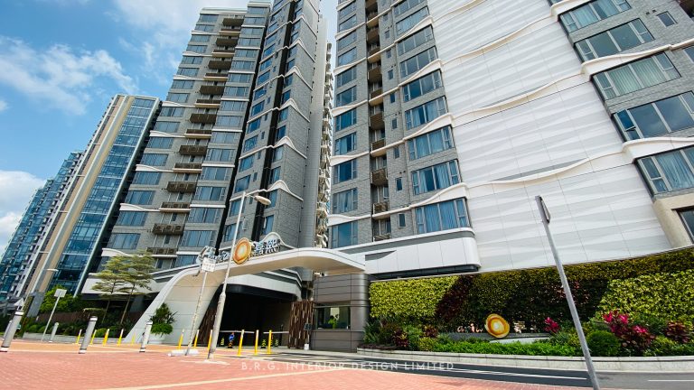
- 物業:采葉庭 The Parcville
- 建築面積:609sq. ft.
- 實用面積:460sq. ft.
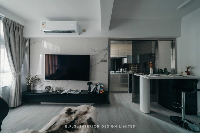
This unit, which is located in The Parcville, Yuen Long, is a sweet home bought by a young couple. The original design was old and outdated as it was an 18-year old residential building at the time of purchase. The client preferred renovating the space without changing the main structure and refurbishing it to bring a new modern sense to the old house.
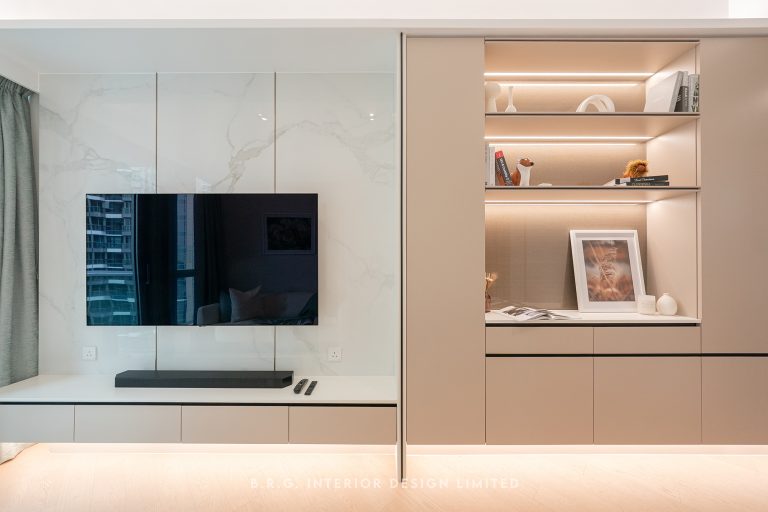
The client likes golden rose colour and Nordic style which is simple and in natural tone, but she also believes in Feng Shui that she was told to use bright colours such as purple, red, orange in the house decoration. Our designer solved these two seemingly conflicting directions by choosing the cosmopolitan elements in the Nordic style to link up three requirements coherently. After our magical remould, the aged and dusty house transformed into a bright modern house.
In the kitchen area, the owner likes cooking and collecting teaware from all over the world. We built a U-shape kitchen to increase storage space for cooking wares and the client's collections. The surface of the cooking area is also wider compared to the previous structure which are two separated kitchen tables. Now our client can enjoy her cooking time in this spacious kitchen table freely. We also put a little effort on the kitchen lighting as the window there is relatively small and the kitchen lacks natural light. To provide a better quality of the cooking experience, we installed a row of white and yellow spotlights under the kitchen cabinet to create a natural sun light effect.
The unit area of The Parcville is not big, but through colour matching, custom-made furniture and lighting installation, it creates more visual space with a spacious feeling. The design is full of energy and modern feeling can exactly reflect the young vitality of two owners and their personalities.

