- Nature:Commercial
- Style:-
- Color:-
- Property:劍橋廣場 Cambridge Plaza Poinciana
- Building Area:1229sq. ft.
- Practical Area:1133sq. ft.
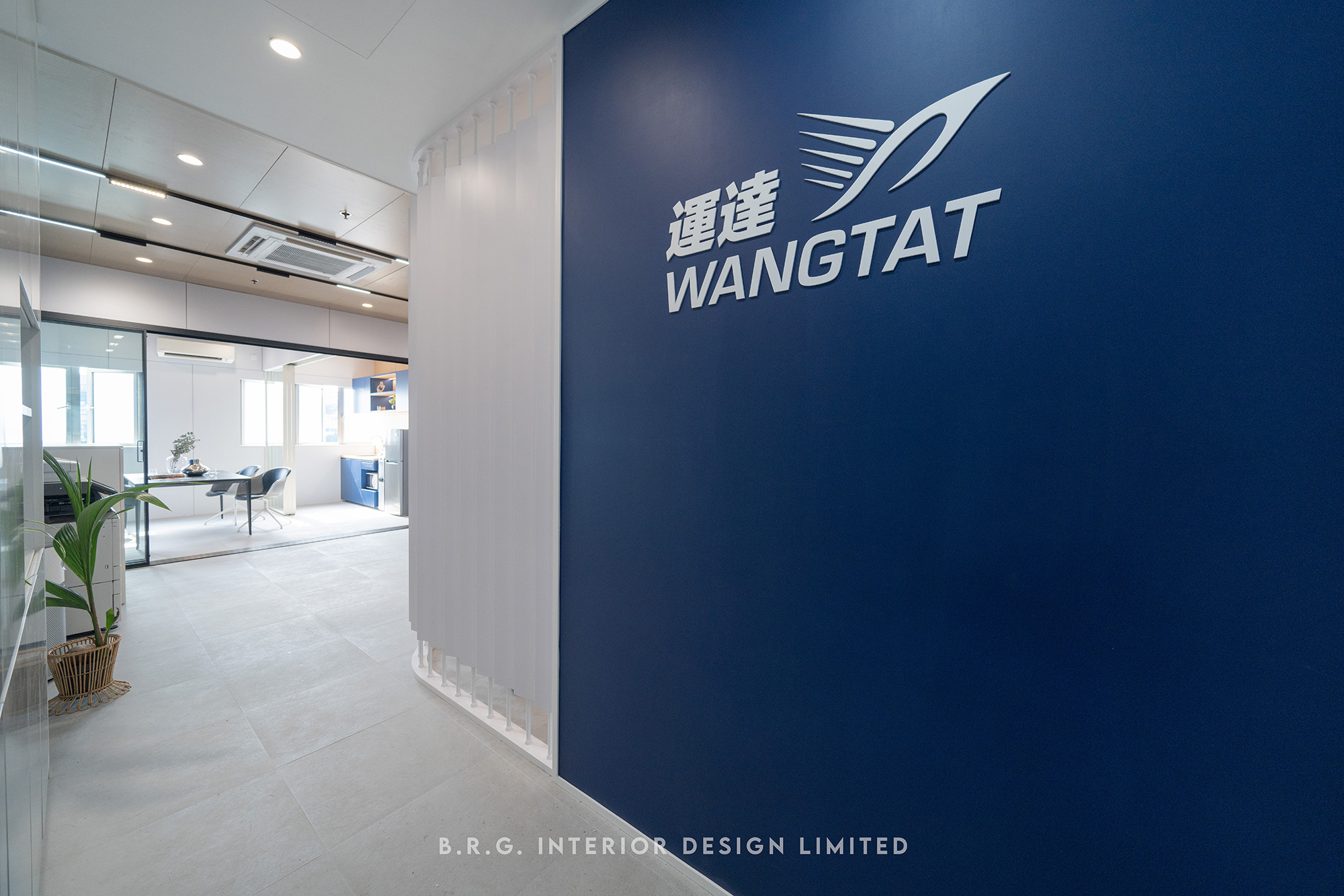
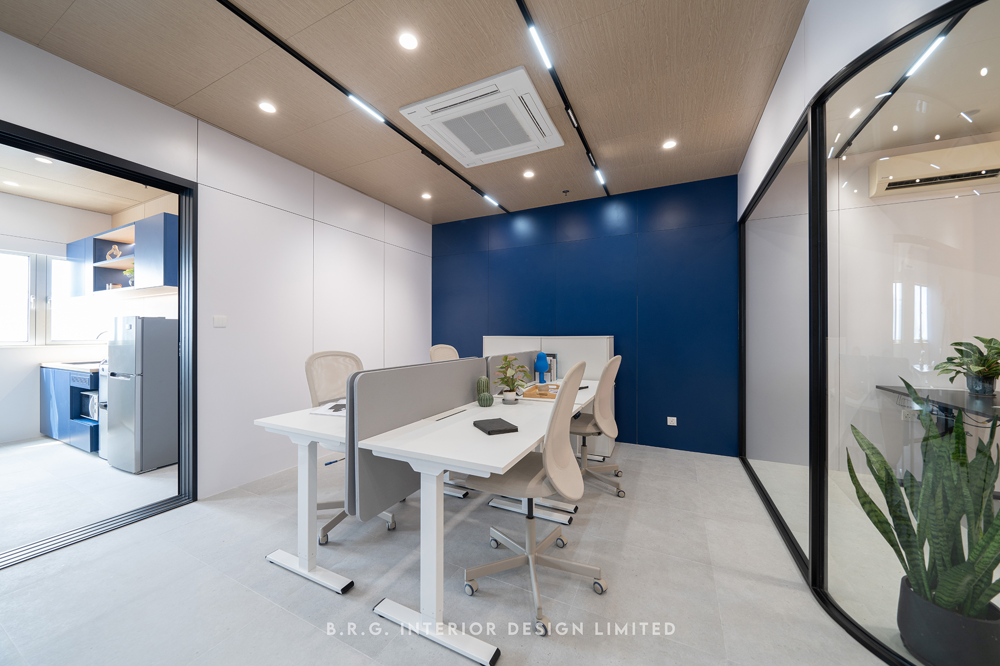
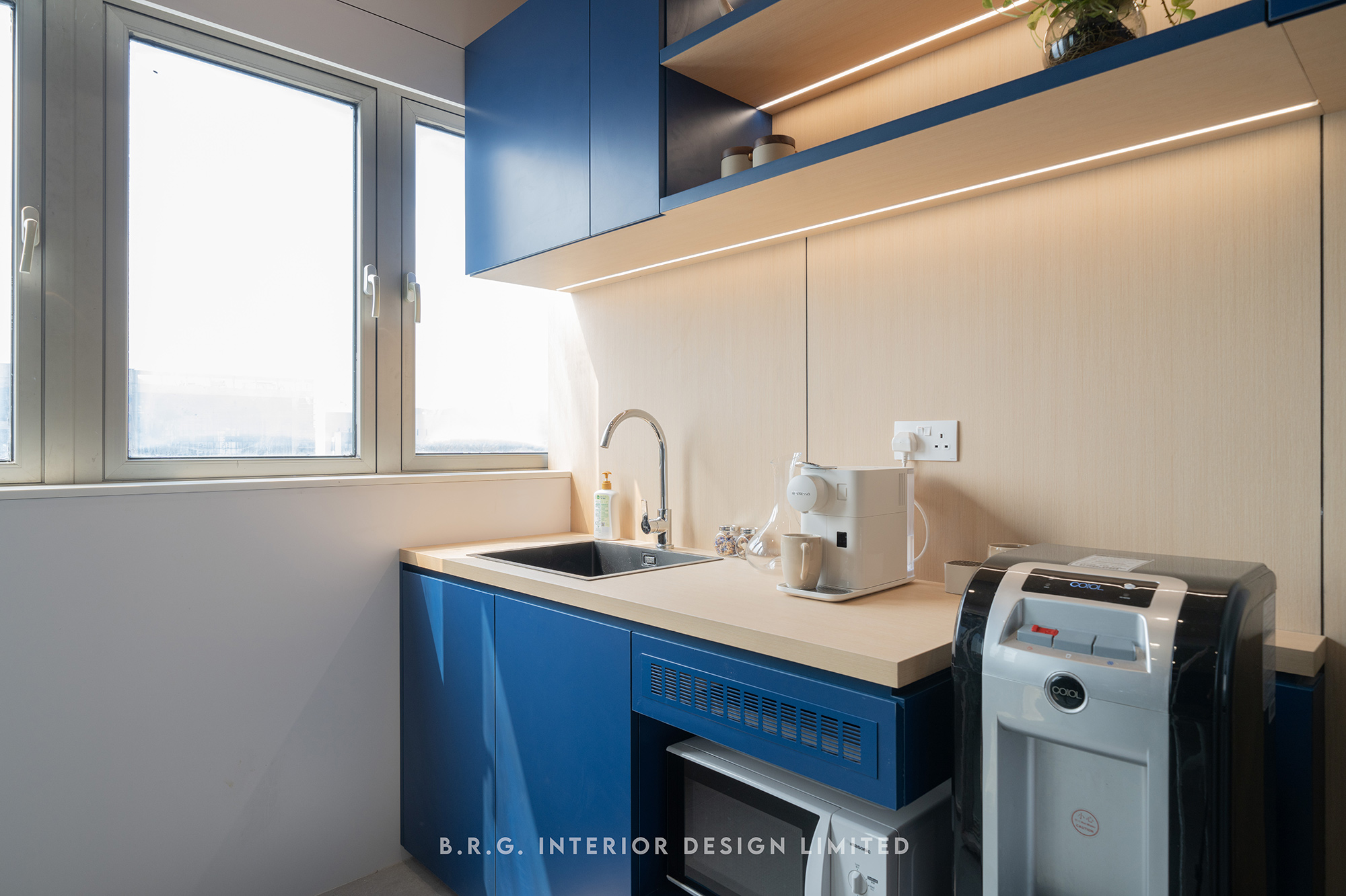
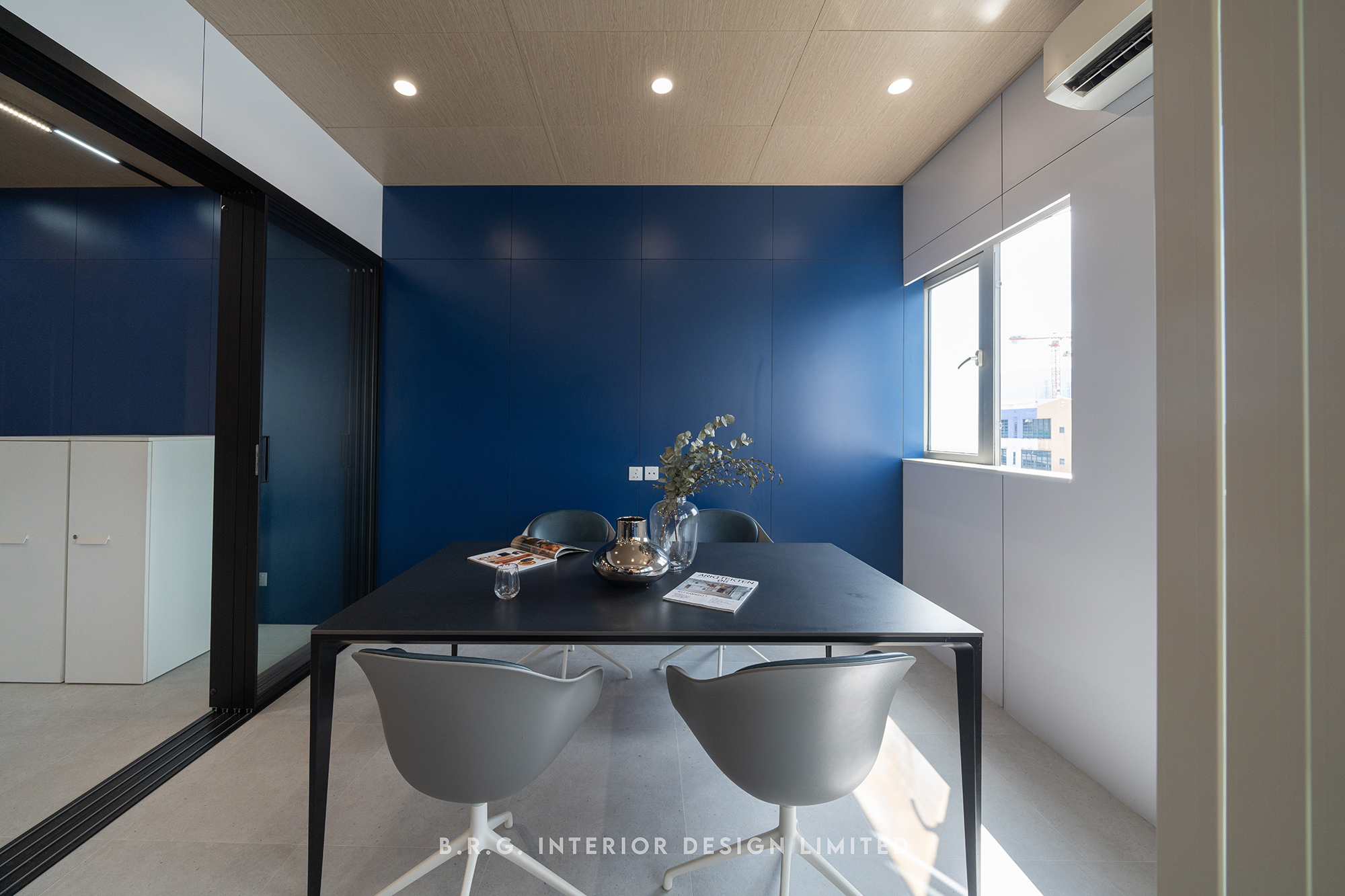
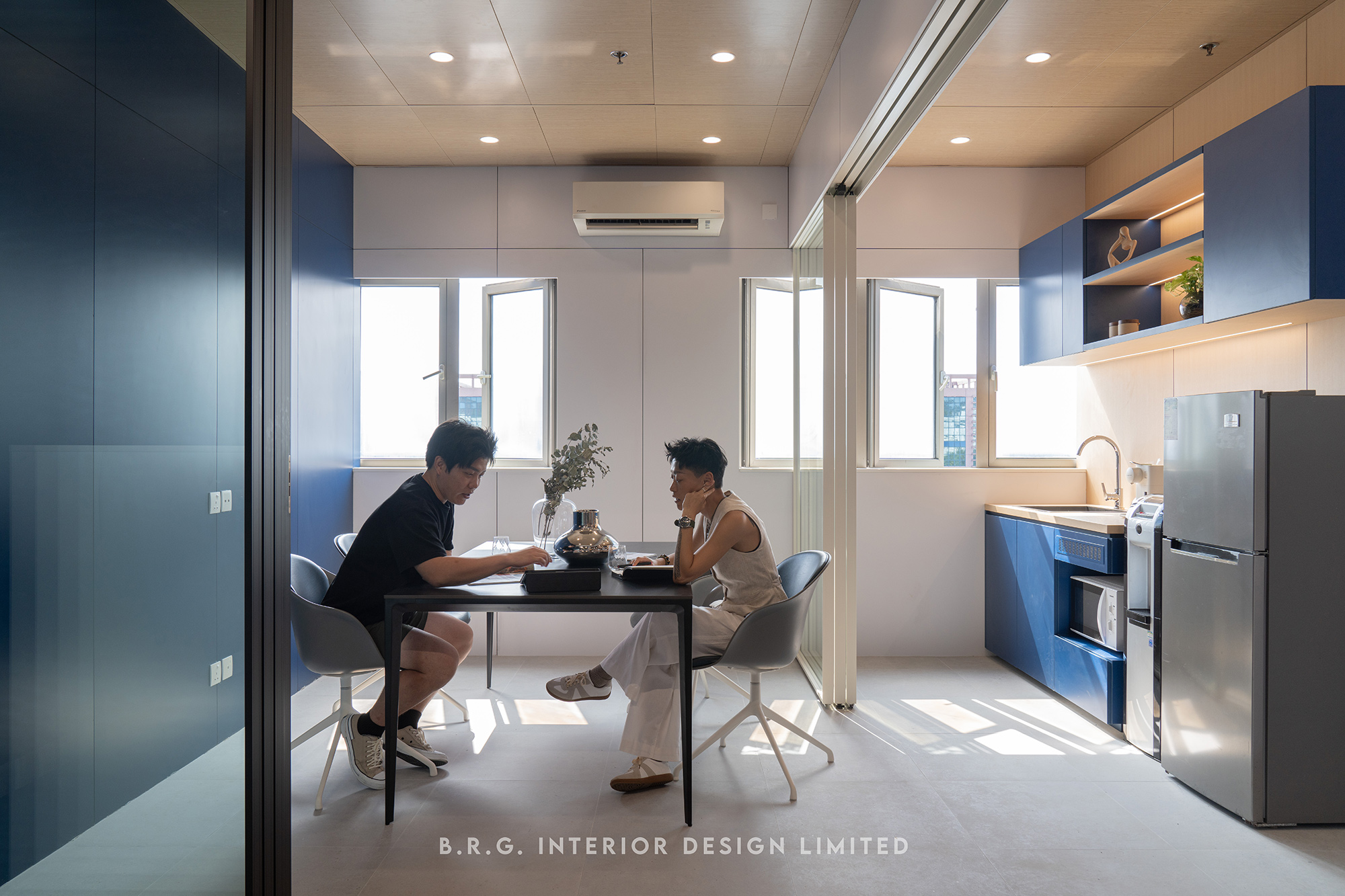
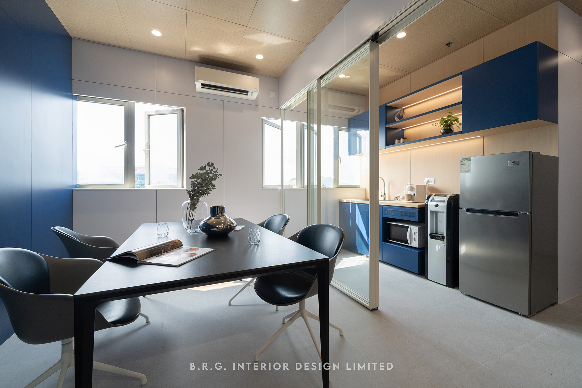
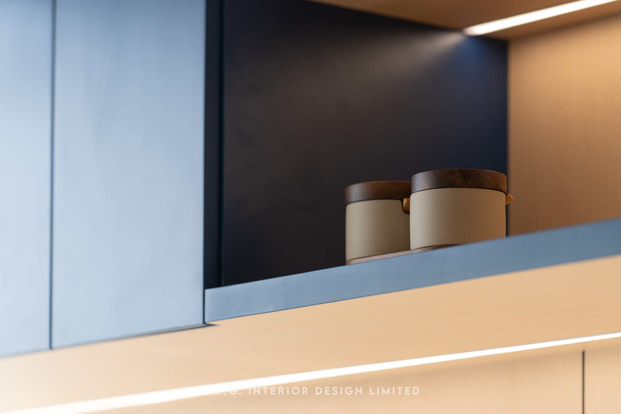
Ocean blue and clean white are the brand colours of this logistics business. In this project, we have incorporated these two main colors, representing brightness and innovation, into the entire office renovation design.
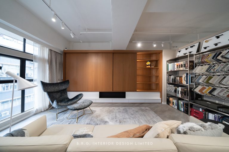
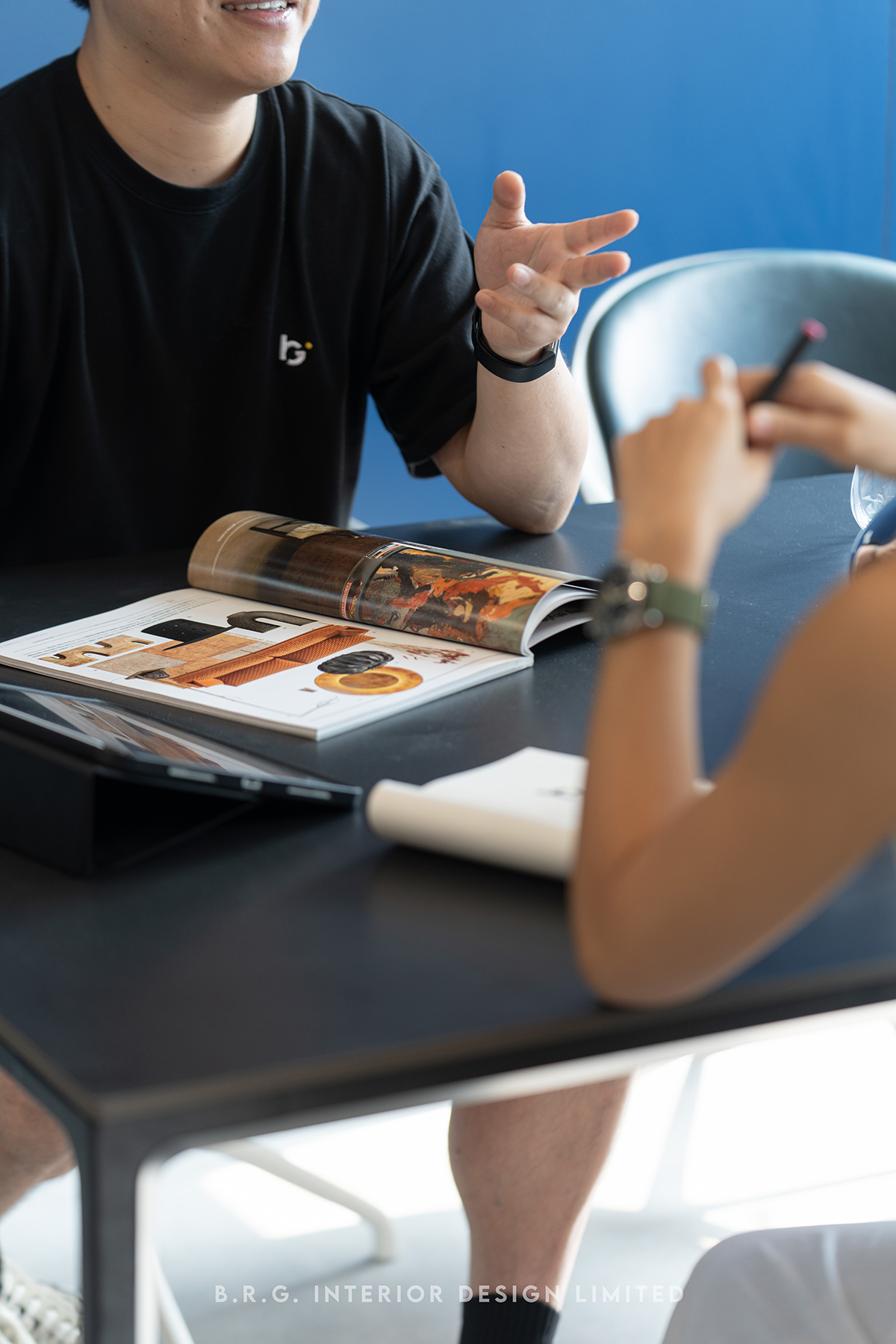
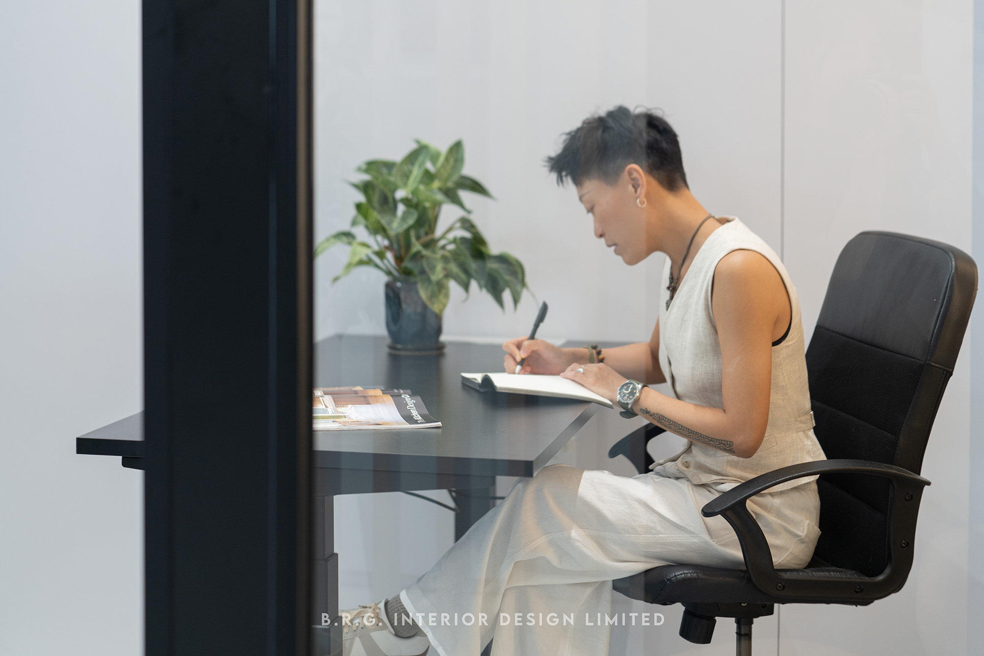
Openness reflects trust
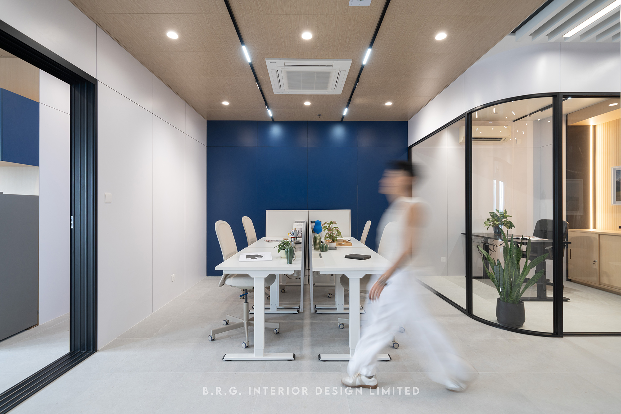
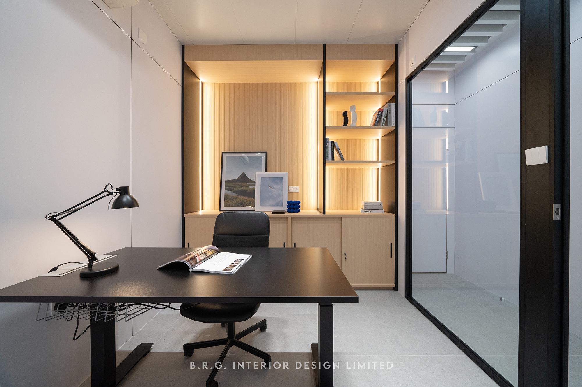
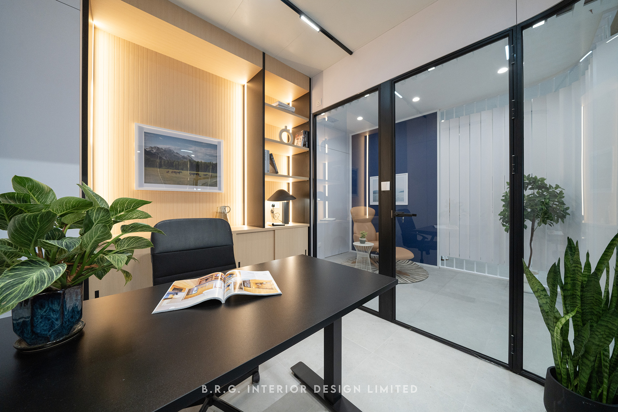
The design pattern of a space can fully reflect the relationship among team members. The long-term partnership between this family business and its employees deserves a design that connects the conference room, pantry area, and adjustable office spaces in an open layout. Transparent glass is used to separate each functional area, including the individual offices of top management. This minimalist and bright design not only allows more natural light to enter through the windows, but also symbolizes the true meaning behind the work environment: respect, trust, and cooperation.
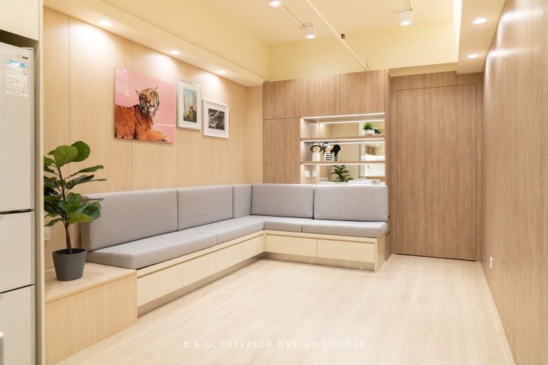
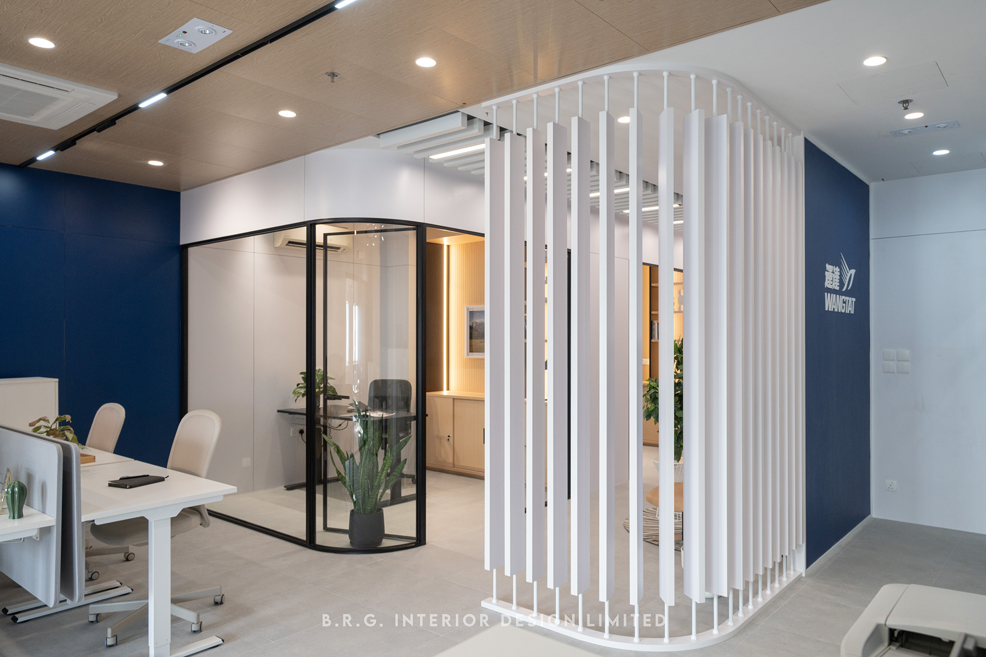
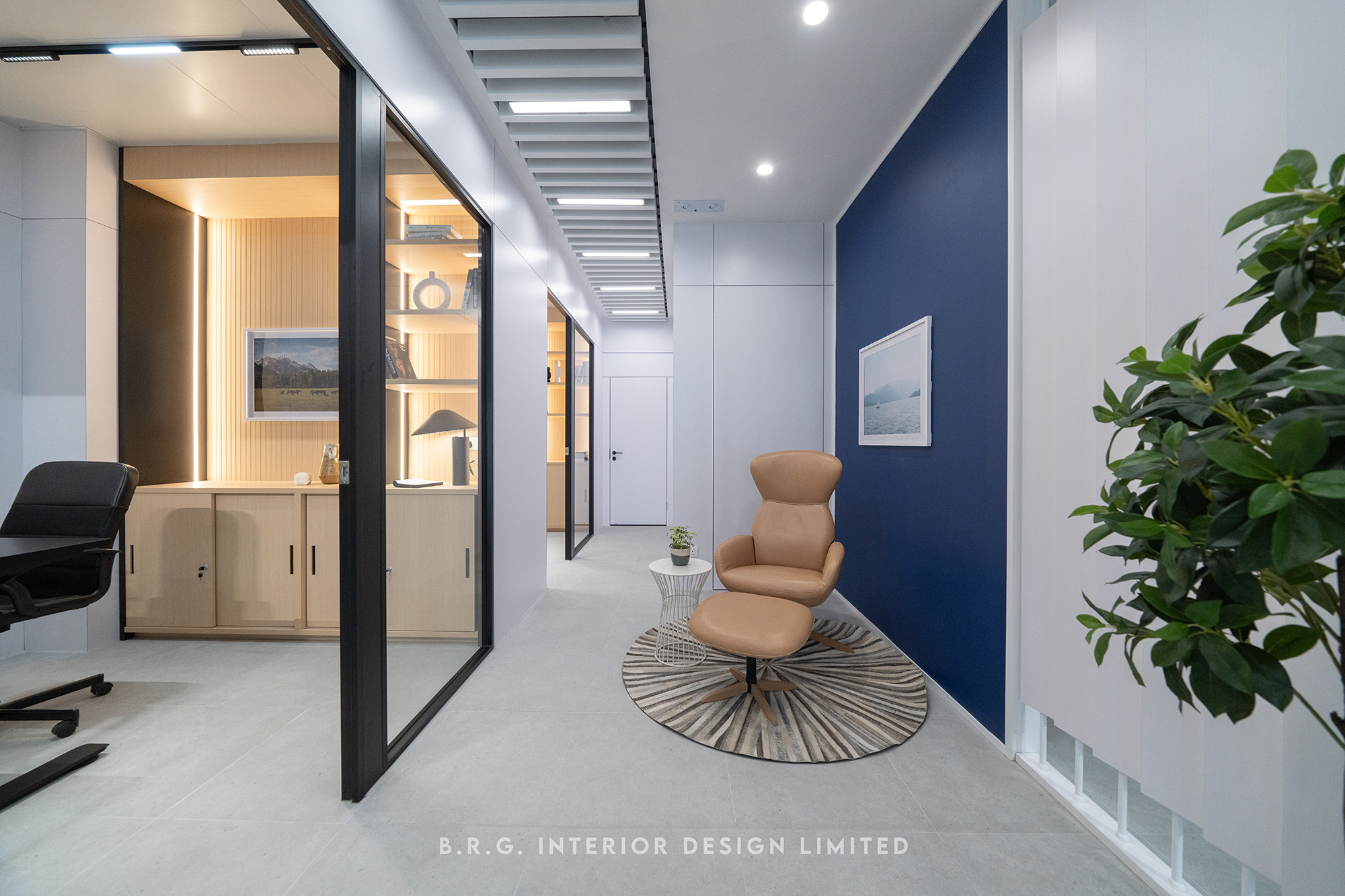
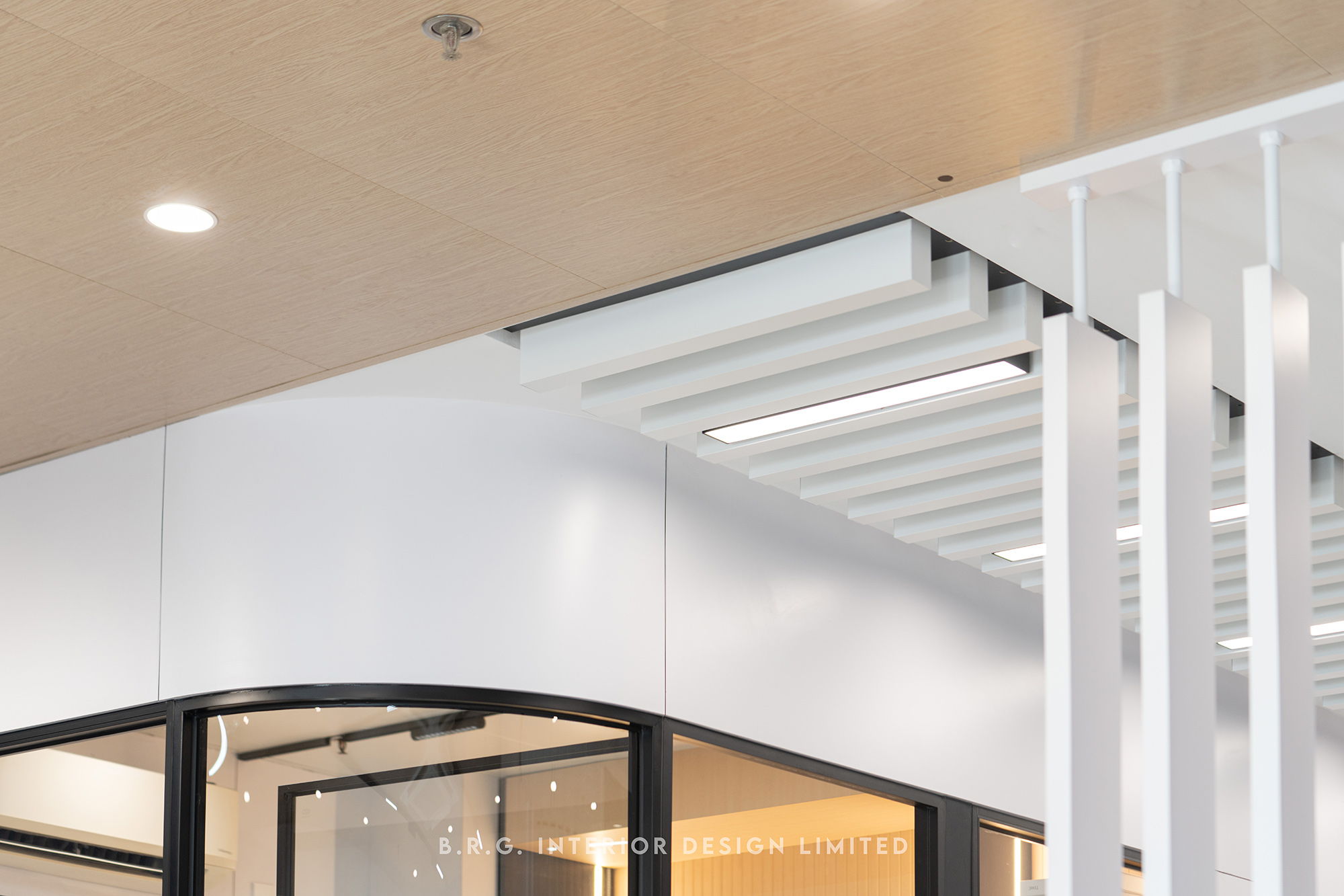
Multi-functioning breakthrough spaces
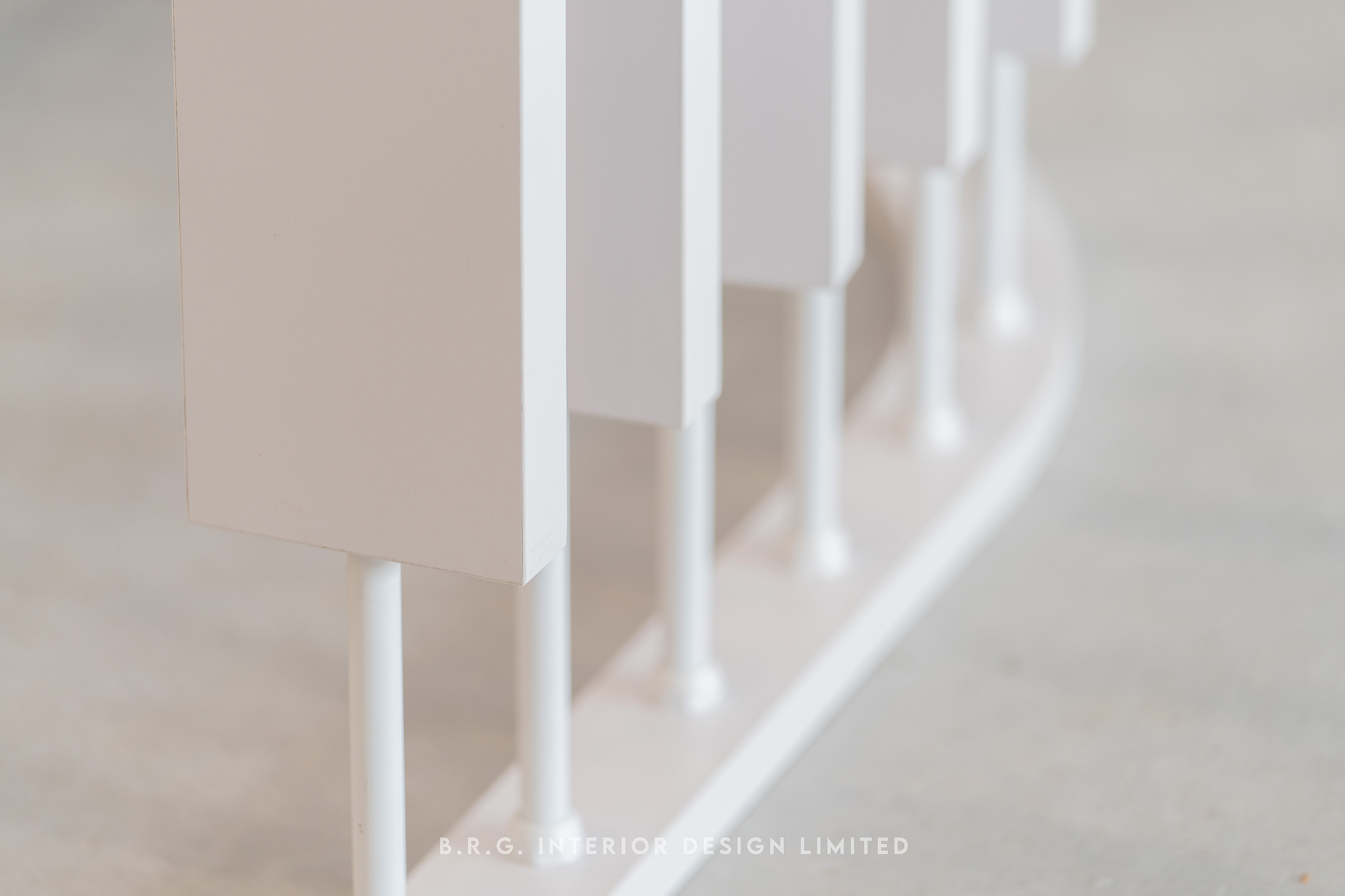
The corridor at the office entrance has been specially designed with a white, organically shaped, rotatable screen. The semi-visible space continues the concept of an open layout, creating a lightweight division that serves as both a waiting area for clients and a private corner for employees to take a break. The attention to detail in this design once again brings a sense of high privacy and comfort to any space.
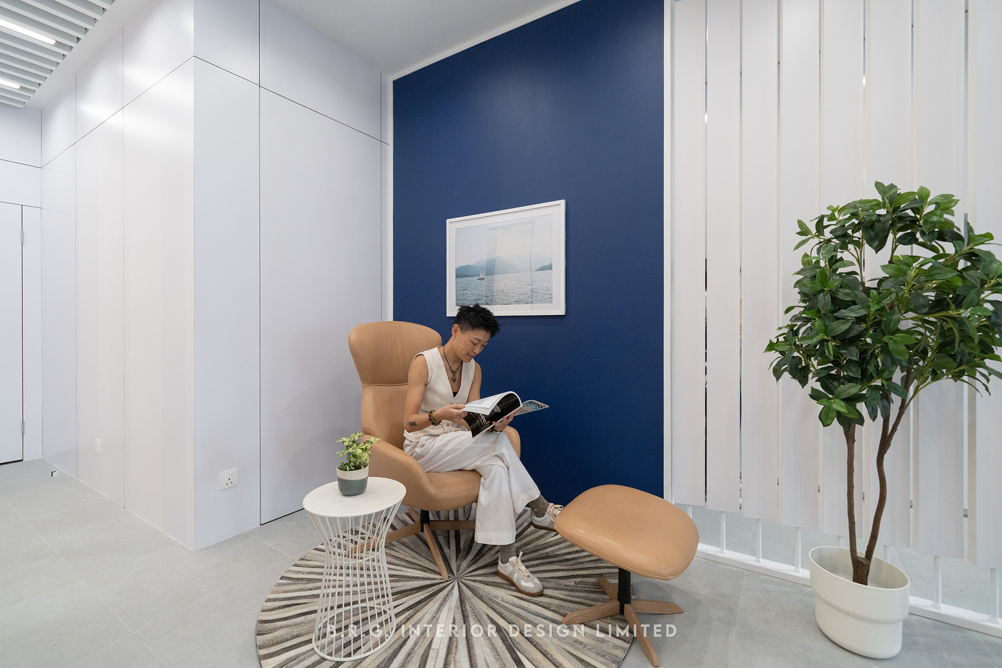
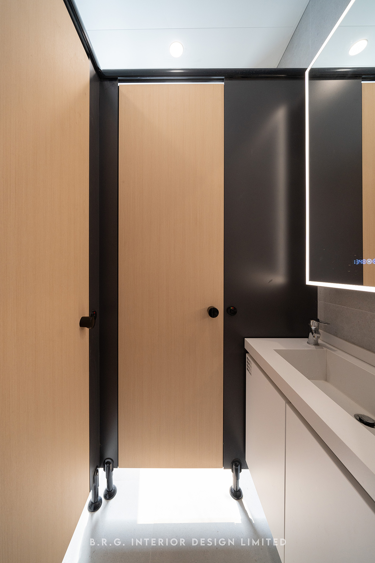
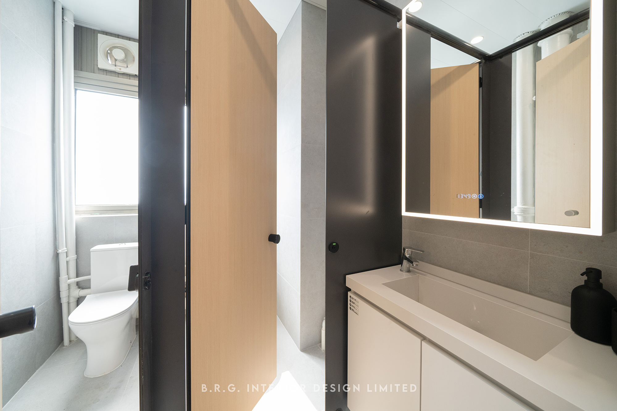
Authenticity lies in simplicity
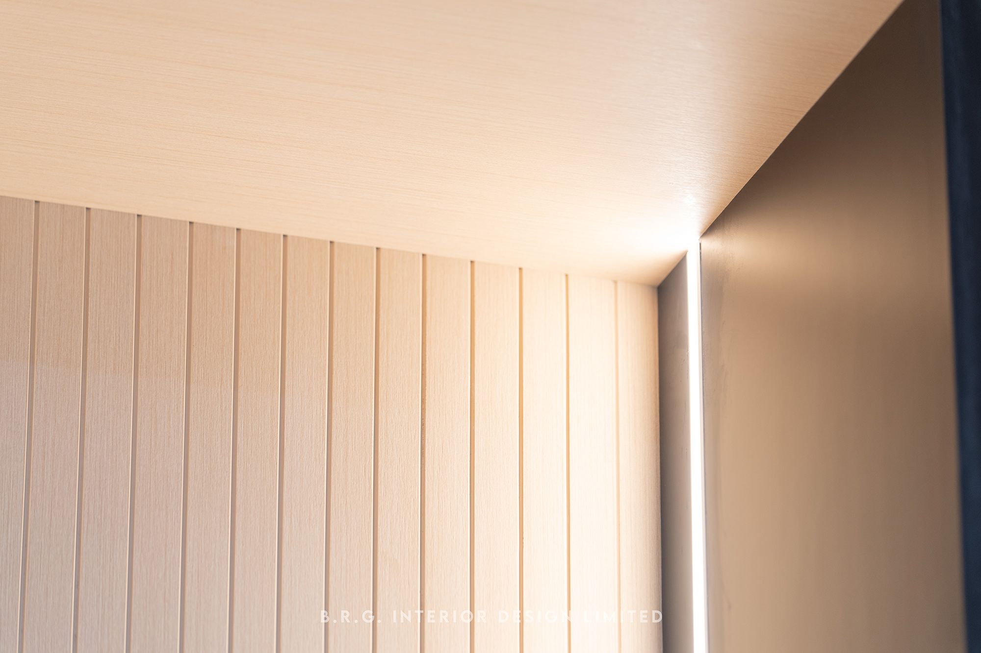
Intense contrast of blue and white natural colors, paired with consistent light wood tones for the ceiling and cabinets. In order to incorporate as many earthy elements as possible in a limited indoor space and enhance the visual comfort of the work environment, the floor and bathroom walls are specially chosen with the light grey tiles called “Moonstone”. All these back-to-basics elements reflect the company's initial vision and adds a touch of sophistication and innovation to the overall design.
We are delighted to see our designs being able to walk through another new milestone with various industries.


