半島豪庭 GLADIOLUS

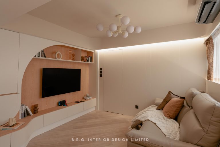
In our latest venture, we embraced the design request for Royal Peninsula. The distinctive arc-shaped architecture of the entire estate extends into each unit, forming a unique shell-like structure. Unlike conventional square spaces, this design challenge involves not only straightening but also customizing furniture to complement the curved layout, enhancing the spatial perspective. Moreover, some Hong Kong buildings, like Royal Peninsula, have internal structures such as plumbing or wiring connecting adjacent units. Besides design, our role includes acting as a communication bridge, ensuring coordination with other homeowners and explaining the engineering processes involving different floors, ensuring each step meets safety standards for a worry-free design.
Understanding the lifestyle and preferences of the homeowners and their family is paramount to determining the final design style. This design caters to guests with diverse requirements, including preferences for audio, photography, dancing, serene resting spaces, and more. The clients favor a Japanese minimalist and functional style, appreciating the raw beauty of industrial elements and untreated color schemes. How do we find balance within these preferences to meet the requirements?

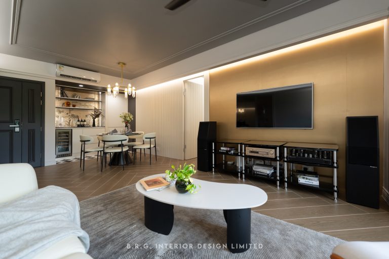
Adapting to management guidelines, such as specific classical gate styles, and balancing all interior and exterior settings and requirements, the chosen style for this project is the "Modern Industrial" style known for its high inclusivity, seamlessly blending the "new" and the "old."

This style emphasizes the use of raw materials such as brick, wood, and metal. The overall color palette is dominated by gray and neutral tones, evoking an industrial feel with a modern touch. For the living room walls, we opted for a water ripple textured paint, providing a rugged visual effect resembling cement while maintaining a smooth surface, showcasing both rawness and durability brought by paint technology advancements. 

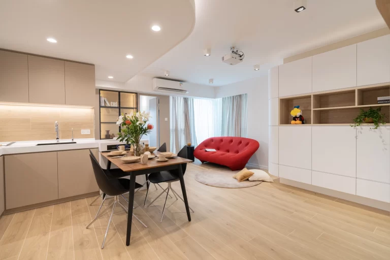
Family interaction is a priority for the homeowners. For instance, in the kitchen, folding aluminum windows replace fully open spaces, enhancing interaction among family members while preserving separation functionality.

To infuse warmth into the home, we deliberately incorporated walnut veneers. Striking a balance between nature and the processed original mid-tones, with a hint of Japanese wooden products, we harmonized classical and primitive industrial styles, blending them seamlessly. Special attention was given to details like 30-degree arc angles, such as in the connection between the piano cabinet and TV cabinet, allowing flexibility for the future selection of different-shaped audio equipment. 

In the bedroom, each space is tailored to the unique personality of the user. Reflecting the strong affection and hopes of the homeowners for their family, the larger space is allocated for the daughter's room, dominated by natural wood tones, creating a superior environment for the child to explore various possibilities and create her own space. For the master bedroom, the industrial feel is more pronounced, complemented by a blue-gray cement-patterned wall covering, emitting a subdued and calm atmosphere, perfect for relaxation.
Designing with a willingness to delve into history, one discovers subtle connections. With appropriate linking, one can find a style that truly belongs to their home.